December 16, 2021
Geographic Weighted Regression of Ridership on Socioeconomic Determinants. Completed in R
Introduction
Throughout the COVID-19 pandemic, it has been widely discussed in daily conversation and social media that while many professional and information class workers were able to stay home, lower-earning essential workers were not able to avoid in-person work. The American Public Transportation Association (APTA) describes that bus users tend to be on the lower end of the earnings spectrum while rail users tend towards the higher end of the earnings spectrum (APTA, 2017). With this we can make many predictions about which forms of travel would be most utilized during the pandemic and which would be abandoned. Based on APTA’s schema, we could make an educated guess that bus would continue to be used higher rates while rail transit would not be used as widely.
Understanding the relationship between socioeconomic status and rail transit, it would be fruitful to ask how the magnitude of these known determinants of ridership varied across the city during the Summer of 2020, at the height pandemic mobility restrictions. The pandemic presents an opportunity to explore known relationships in a new context and add richness to our understanding of transit justice, COVID times or not.
Pre-COVID and COVID Rail Transit Usage
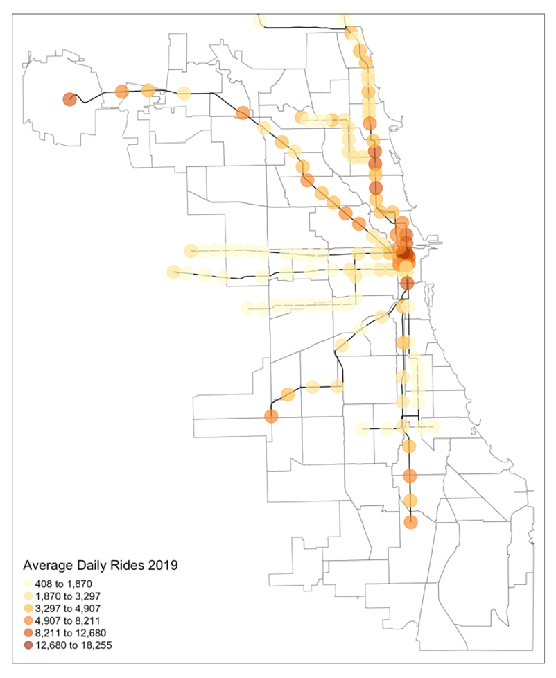
Above we see average daily rides per station in 2019 which I am using as my pre-pandemic baseline. Urban rail ridership in Chicago is concentrated in Chicago’s Downtown, North, and Northwest sides. While ridership at several stations on Chicago’s Southside have ridership levels comparable to Northside stations, rail transit is utilized less on the South and West sides where entries tend to be on the lower end of spectrum.
While a study or rail transit might not seem as relevant as bus to the areas of interest to my work, areas with concentrations of marginalized residents, there are still insights to be gained from studying their pandemic period utilization of rail transit. What we find is that even though these low-income, non-white communities on the West and South sides continued to use rail transit at higher rates than the rest of the city. More specifically, it appears that majority-Black neighborhoods are where rail transit ridership wavered the least. So, while rail transit is sometimes regarded as a higher-income travel mode, for the benefit of captive transit riders, both need to be well-maintained and treated as life-sustaining services during major disruptions to daily life.
Methods
To complete the analysis, ACS 2019 5-year estimate wide tables (U.S. Census Bureau, 2020a) were collected at the census tract-level using the Census API and joined to the Chicago census tracts layer in R (City of Chicago, 2018b). The initially collected variables totaled 48 and spanned the categories of income, poverty, housing, race, age, employment type, and commute data. I also utilized 2019 U.S. LODES data (U.S. Census Bureau, 2020b) which were grouped and summarized to show number of workers and jobs in each tract and then joined to the Chicago census tract layer, now containing 50 variables.
Ridership levels were collected from the CTA – ‘L’ Daily Entries file (City of Chicago, 2021) which contained total entries per day, per station. This data was grouped by station and a daily average was calculated for the months of May through August in 2019 and 2020, this data was joined to the CTA – ‘L’ Station shapefile (City of Chicago, 2018a). Stations beyond the official bounds of Chicago are not included in the GWR and Local Moran’s I analysis. A half-mile buffer was created for each station and the intersection of census tracts and station buffers was taken to produce a polygon layer containing both ridership and census data. To reduce the dimensionality of this data, the data were processed using the correlation matrix function in R. The autocorrelation cutoff was lowered until a reasonable number of variables was chosen; in this case, variables with an autocorrelation greater than 0.30 were automatically dropped, leaving the 12 variables.
Finally, to perform the geographic-weighted regression and Local Moran’s I test, a neighbor list is needed. In this case, the k-nearest neighbor function was utilized to choose four neighbor stations based on distance and a binary weight was assigned.
Local Moran’s I
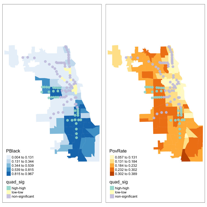
While it is expected that there would be statistically significant clustering of similar pandemic ridership because of residential segregation and self-sorting according to lifestyle preferences, a Local Moran’s I test of ridership levels is performed at the .05 confidence level and superimposed over poverty rate and %Black residents in each community area.
What the Local Moran’s I test shows us is that transit ridership levels were systemically high on the West and South sides but not the majority Latino Southwest side. From this we can conclude that during the pandemic, majority-Black communities that used rail, continued to use rail at higher rates than any other group. While the narrative around transit dependency tends to be about low-income neighborhoods in general, when referring to COVID rail travel and the burden of travel, we need to more specific in saying that it was majority-Black neighborhoods that were most affected. It might be the case that low-income Latino residents on the southwest side also continued to work in-person at high rates, but a separate analysis would be needed to gain some insight into what travel modes were predominant in those areas and what demographic changes might be relevant.
Geographic Weighted Regression
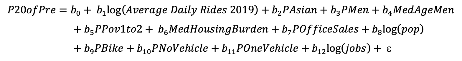
Having gained some insight into the major patterns of where travel continued at higher rates during the pandemic, the next step is to specify a geographic weighted regression of 2020 ridership on the reduced set of variables. An optimal bandwidth of 31,627.28 was calculated and the model is specified as follows:
Overall fit of the model based on the quasi-global R-squared measure was .9283 though this measure might be inflated due to the inclusion of many variables. Future iterations of this project might explore simpler models and compare their AIC, a measure that penalizes of overfitting.
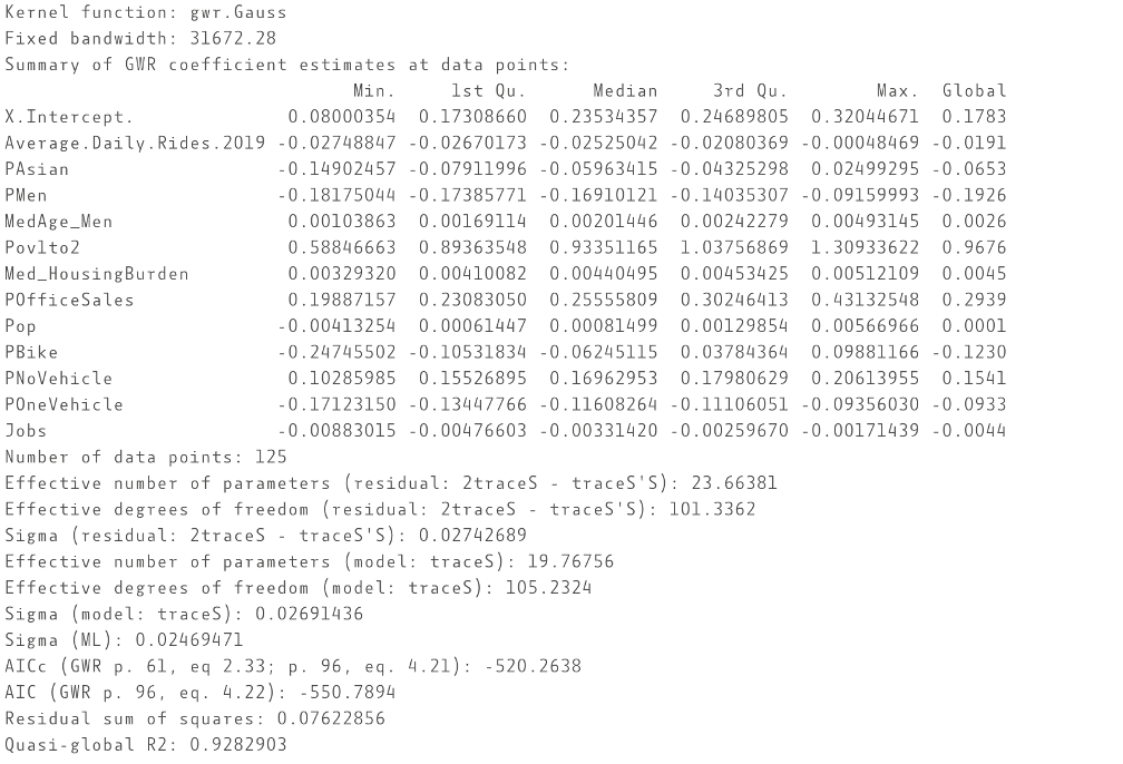
The results of the model show that of the selected variables , the single most consequential explanatory variable was the percentage of households in the transit shed with an income between one and two times the federal poverty level. This is in line with what we expect about the relationship between income and transit dependency and about who continued to travel during the pandemic. With regards to the global coefficient, for every one percent increase in this measure, the increase in rail ridership was 0.97 percent. For reference, the federal poverty line for a household of three was around $22,000 dollars in 2021 (U.S. Department of Health and Human Services, 2021).
The effect varied greatly across the city and was strongest on the Northside. There could be several explanations, but it could be that on the Northside, although there are areas of high poverty, the kinds of concentrations of poverty and dearth of opportunity might allow residents to find other ways of traveling in response to a perceived risk of using public transit, possibly carpooling or taking advantage of better cycling infrastructure. Better transit options on the Northside might have meant that rail transit saw a larger decrease. An interesting follow up would be to compare bus ridership and bikeshare ridership to nearby rail station entries to see if there is some level of migration. It could also be that the Northside in general had jobs that were more likely to fully close during the pandemic. An analysis of when certain business began to open and who worked in those areas might be especially informative for answering this question.
Despite the poverty measure being the single strongest determinant of COVID rail ridership and the effects of other variables were moderate to weak, the variation in their coefficients across space might push us to think about the less obvious measures of transit ridership and what they mean in this context.
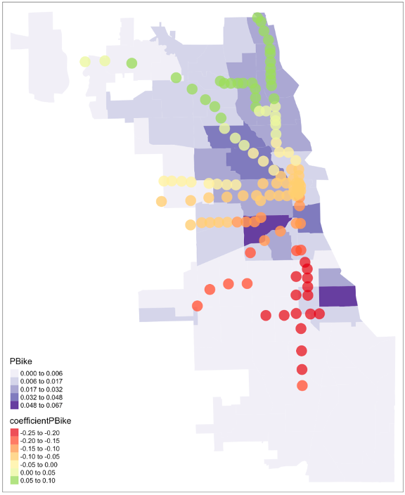
For example, we might look at the effect of ACS bike ridership estimates which is positive on the north side and negative everywhere else. One possible interpretation could be that on the Northside where bike infrastructure is higher quality and more extensive, biking is more widely used across various income groups and has less of correlation with our main determinant, poverty. On the Southside, it might be the case that where there is less bike infrastructure and lower levels of bike commuting because opportunities are further away, cycling reported in the ACS estimates might be associated with students and more affluent residents who might also be heavy transit users. The result might be that part of the income effect and internal variations in income are captured by biking levels on the Southside.
Closing Remarks
From the use of a Local Moran’s I analysis and a geographic weighted regression (GWR), we have gained some insight into where Summer 2020 rail ridership diverged from our expectations about socioeconomic status and transit ridership. We find that when it came to users of rail, it was primarily rail stations in majority-Black areas that saw the highest sustained ridership, a sign that those who utilized rail transit in the area had jobs that did not allow them to work remotely. This is consequential in health and monetary terms as it creates chances for exposure to COVID and creates a differential burden in the form of transit fares that other workers did not experience.
While the true relationships behind COVID rail ridership levels and the process behind the reduction in data dimensionality used might be difficult or impossible to fully grasp, this type of exploratory data analysis guided by automation can be used to explore less studied mechanisms within transit research and can be a first step in planning further research into diverse areas of transportation and mobilities research. An approach to data analysis that emphasizes exploration can be just as fruitful as research that aspires to explanation.
References
American Public Transportation Association. (2017). Who Rides Public Transportation. [report]. Retrieved from https://www.apta.com/wp-content/uploads/Resources/resources/reportsandpublications/Documents/APTA-Who-Rides-Public-Transportation-2017.pdf
City of Chicago. (2021). CTA – Ridership – ‘L’ Station Entries – Daily Totals. [data file]. Retrieved from https://data.cityofchicago.org/Transportation/CTA-Ridership-L-Station-Entries-Daily-Totals/5neh-572f
City of Chicago. (2018a). CTA – ‘L’ (Rail) Stations – Shapefile. [Shapefile]. Retrieved from https://data.cityofchicago.org/Transportation/CTA-L-Rail-Stations-Shapefile/vmyy-m9qj
City of Chicago. (2018b). Boundaries – Census Tracts – 2010. [Shapefile]. Retrieved from https://data.cityofchicago.org/Facilities-Geographic-Boundaries/Boundaries-Census-Tracts-2010/5jrd-6zik
City of Chicago. (2015). CTA – ‘L’ (Rail) Lines – Shapefile. [shapefile]. Retrieved from https://data.cityofchicago.org/Transportation/CTA-L-Rail-Lines-Shapefile/53r7-y88m
U.S. Census Bureau (2020a). 2015 – 2019 American Community Survey 5-year estimates. Retrieved through Census API.
U.S. Census Bureau (2020b). 2019 LEHD Origin-Destination Employment Statistics (LODES). Retrieved from https://lehd.ces.census.gov/data/
U.S. Department of Health and Human Services. (2021). U.S. Federal Poverty Guidelines Used to Determine Financial Eligibility for Certain Programs. Office of the Assistant Secretary for Planning and Evaluation. Retrieved December 7, 2021, from https://aspe.hhs.gov/topics/poverty-economic-mobility/poverty-guidelines.
